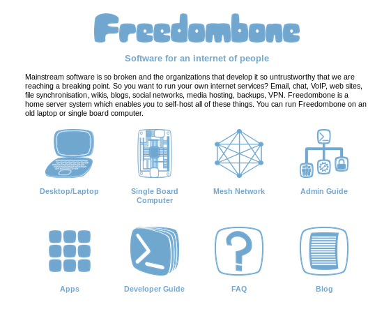
A few tweaks have been made to the index page of the website.

Information about the mesh version now has its own icon and the Patreon icon has been removed so that there are two rows of four icons. The icons have also been made not so overwhelmingly gigantic. This makes the site look better on a small mobile screen in portrait orientation. The Patreon link has been moved into the FAQ.